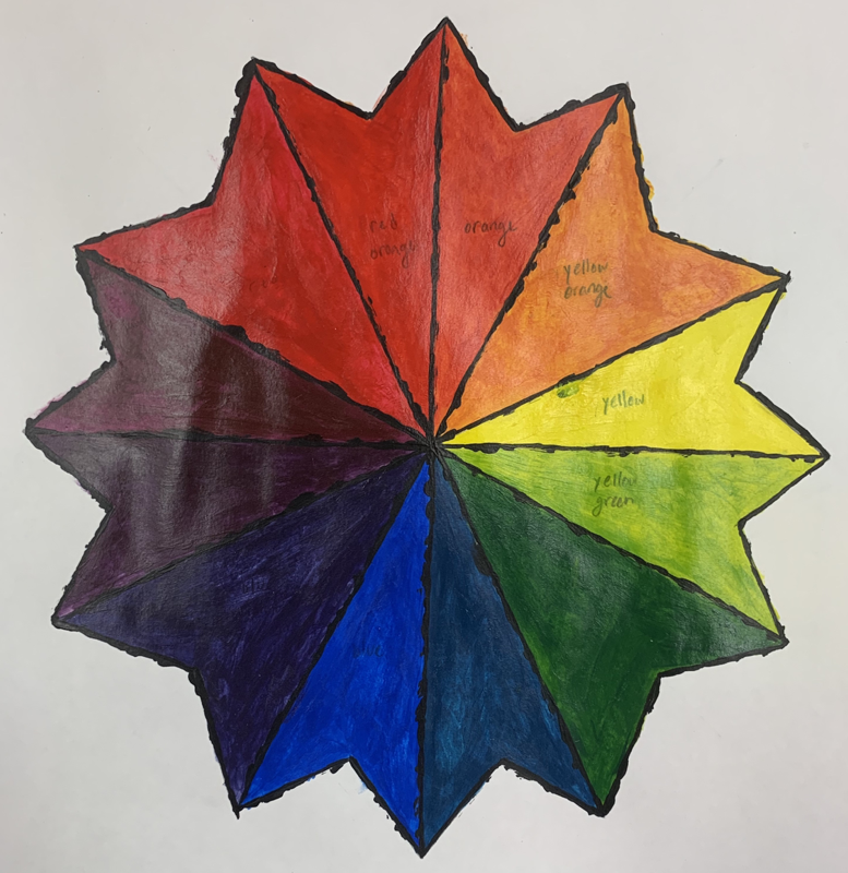
First Day Drawings
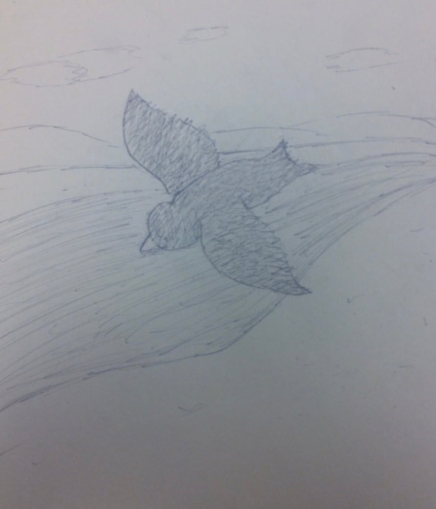
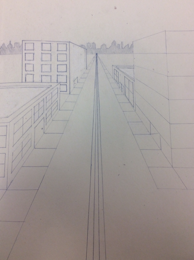
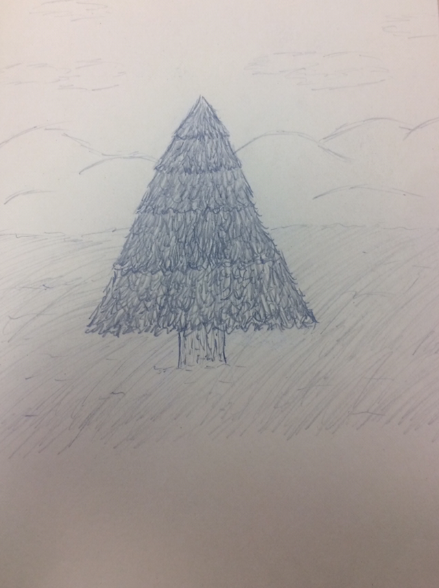
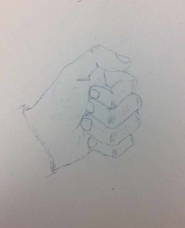
We had to do four different drawings on the first day of the class. We had to draw a tree in a landscape, an animal, a street scene, and a hand. I feel that the most difficult one was drawing the animal because I’ve never drawn one before.
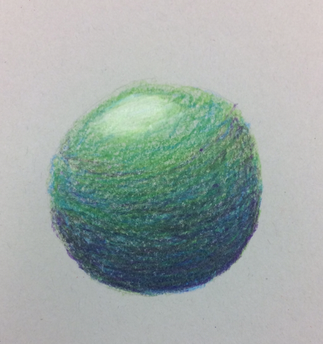
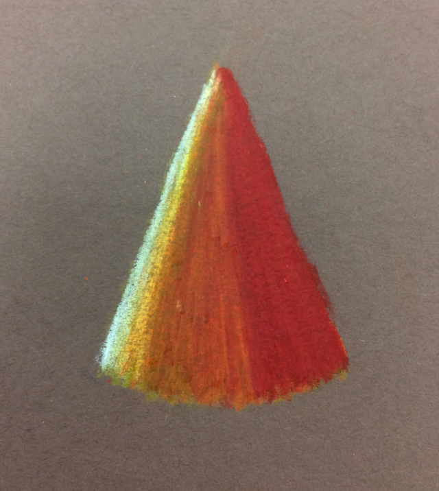
Object Value Drawings
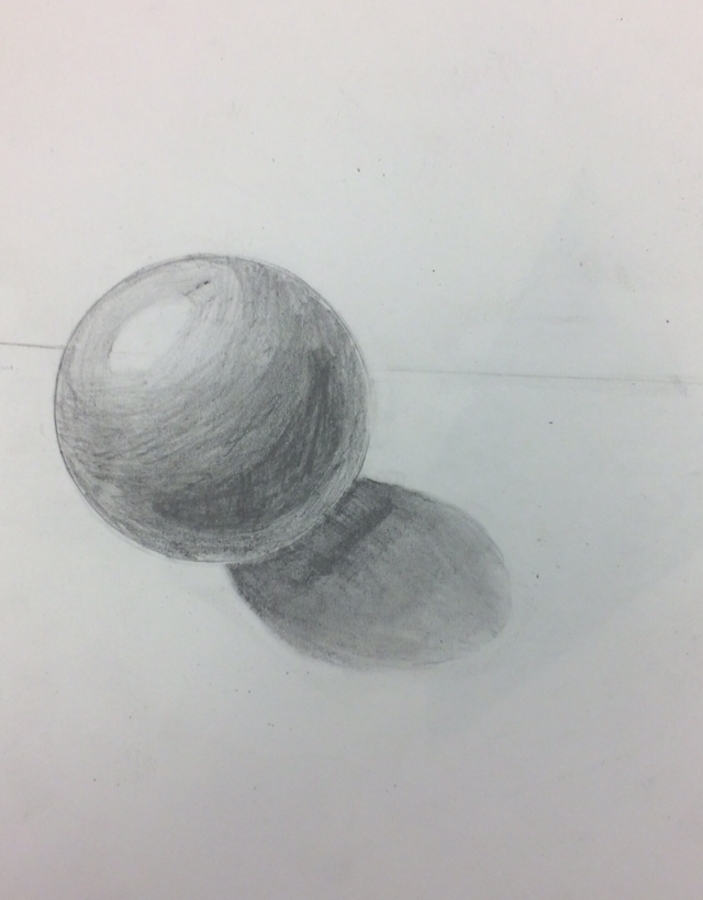
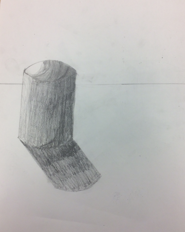
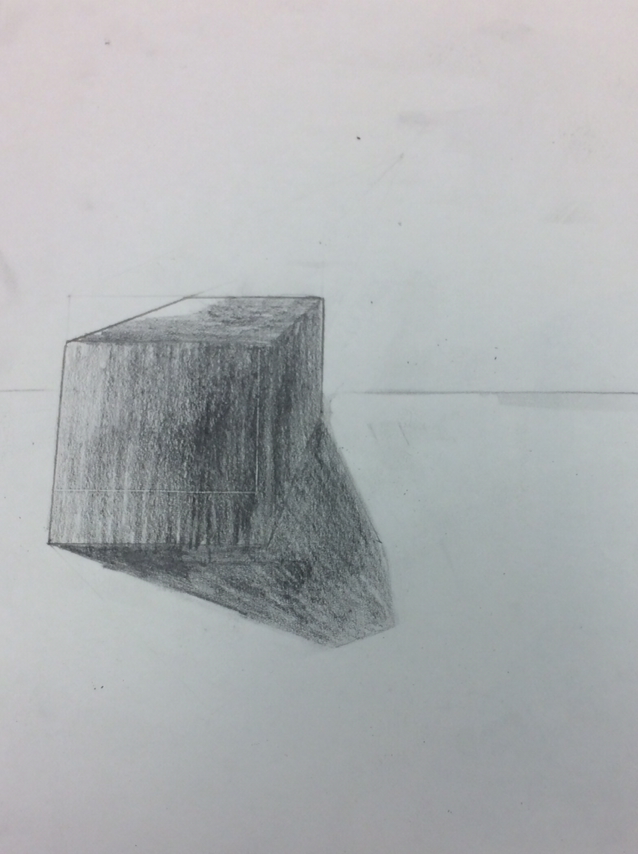
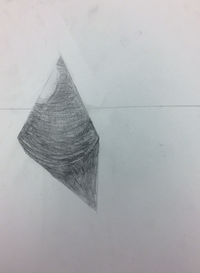
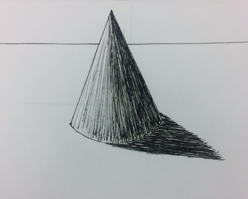
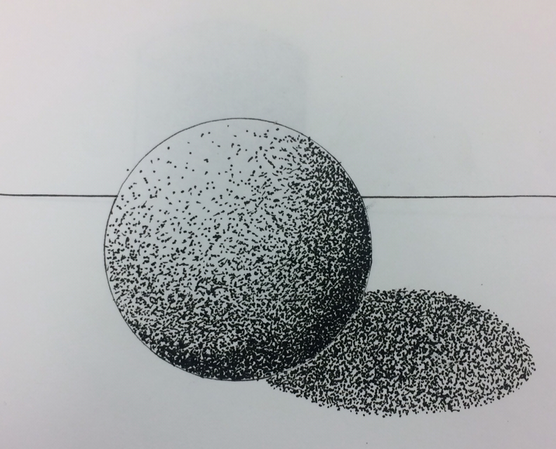
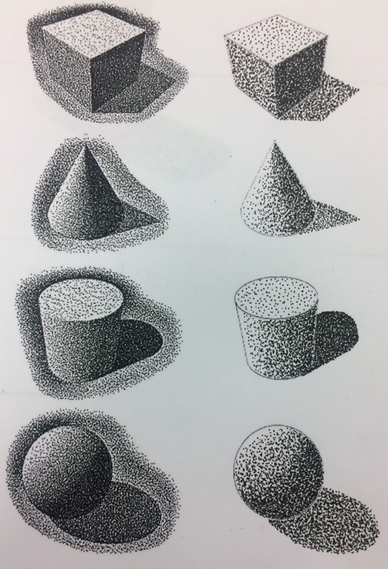
We had to draw a sphere, cube, cylinder, and a cone using the 9 step value scale. I liked doing the sphere the best and didn’t like doing the cone.
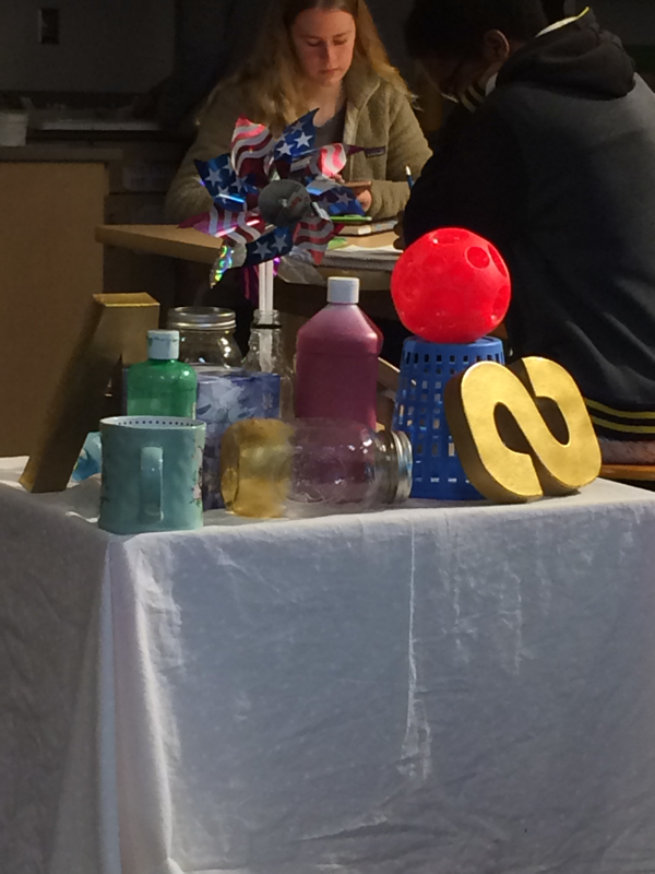
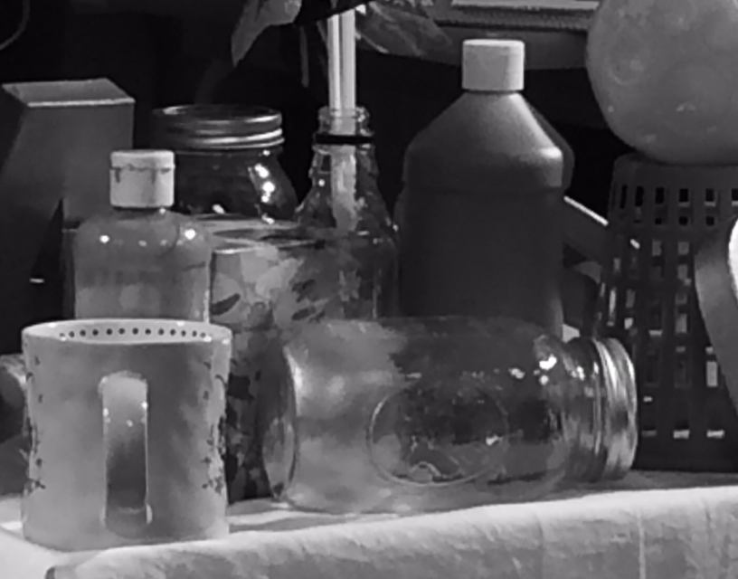
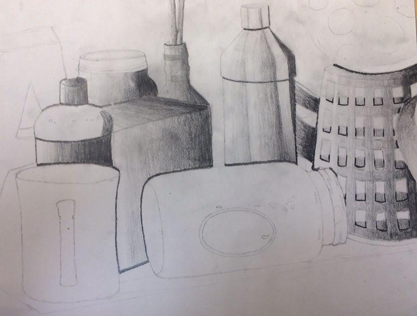
Object Value
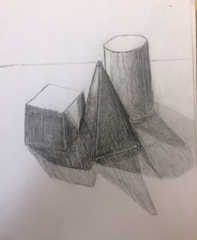
We has to draw 3 different objects on a table. While drawing them we had to add value and shadows to the different objects. I liked leaning how to shade the objects better.
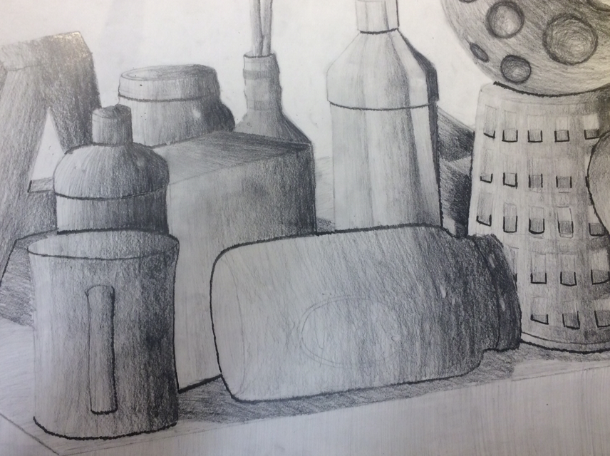
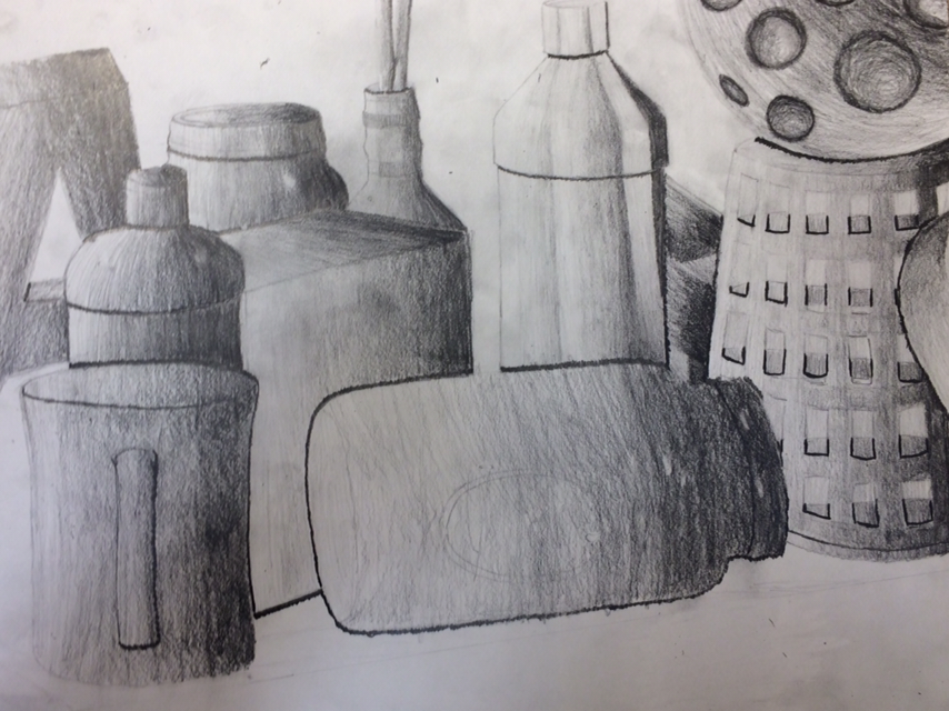
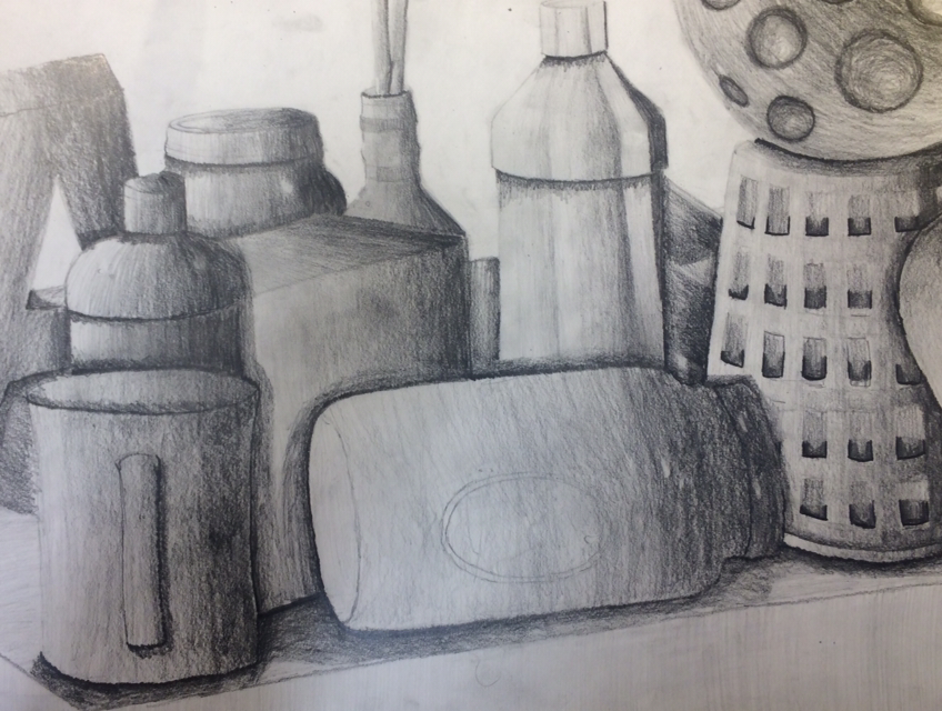
Pencil Still Life
Final Project
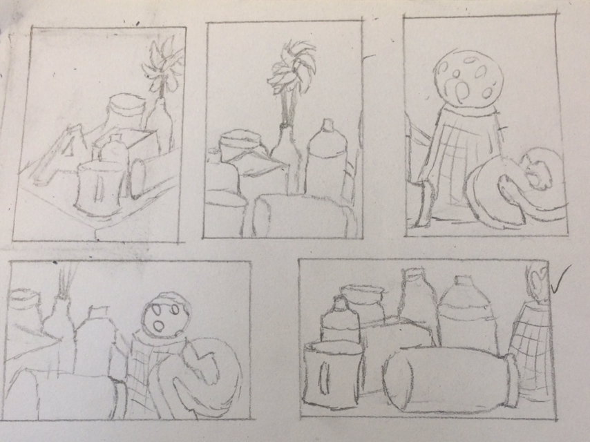
1. I drew 5 different compositions from different angles. After that I picked my favorite one and decided to draw that one.
2. I think that I used a wide range of value throughout the whole piece. You can tell where the highlights and shadows are in my piece.
3. If I were to try this without practicing with smaller pieces, I think that it wouldn’t have turned out this good. I think that the textures would be messed up and the shadows bright casted on other objects wouldn’t be that good either.
4. For the darks in my piece I used a 4B pencil and put a lot of pressure on it so you can tell where the dark spots and shadows are. For the medium and light areas I used a 3H pencil and put very little pressure on the light areas and highlights.
5. I think that if you don’t have texture in a piece it would make it really hard to tell where the light is coming from and how far objects are away from each other. You wouldn’t be able to tell where the shadows are and where the highlights are.
6. If I were to recreate this I would probably wait to add the darks until the end because it made it hard trying to fix it when I messed up. I would also try to blend the whole piece better.
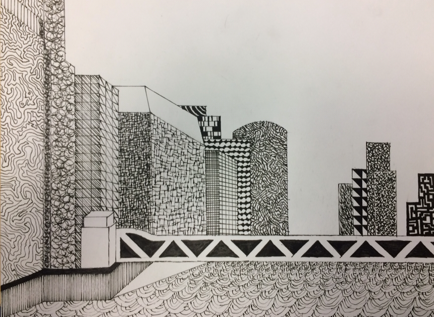
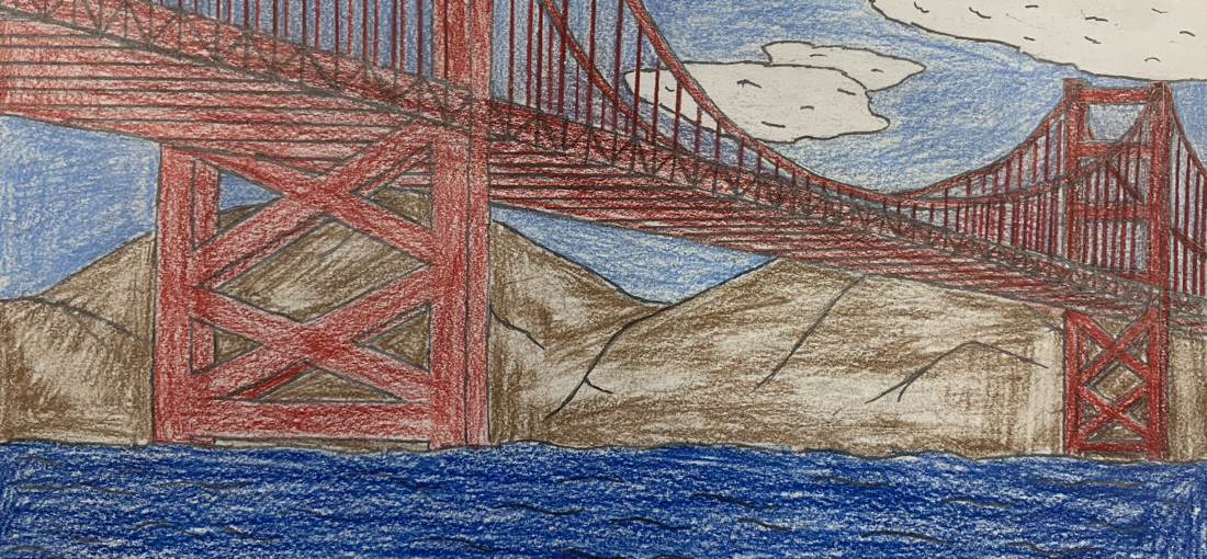
Pen and Ink
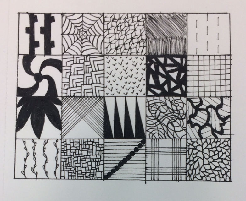
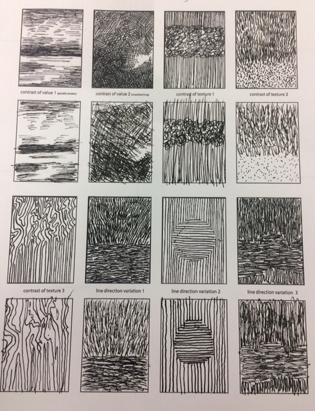
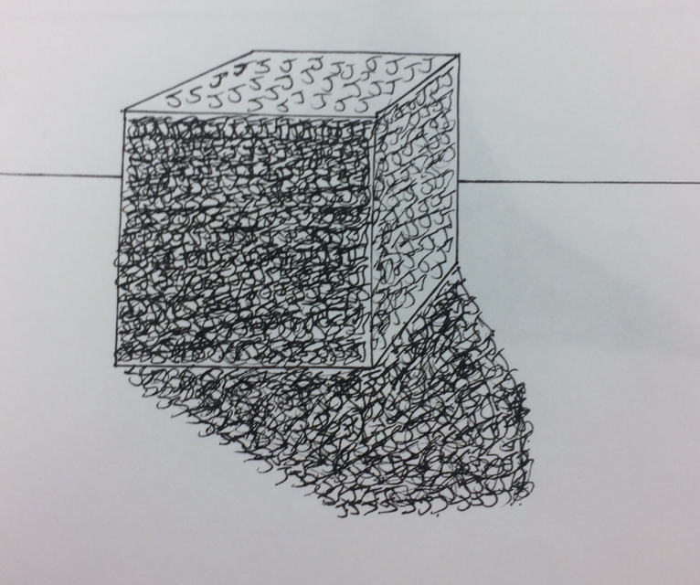
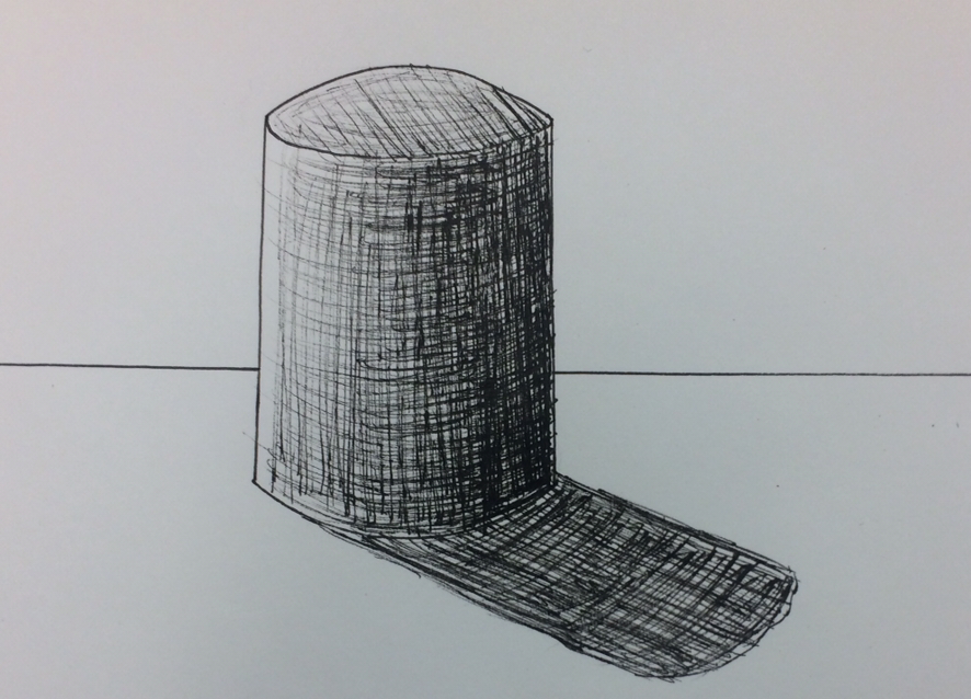
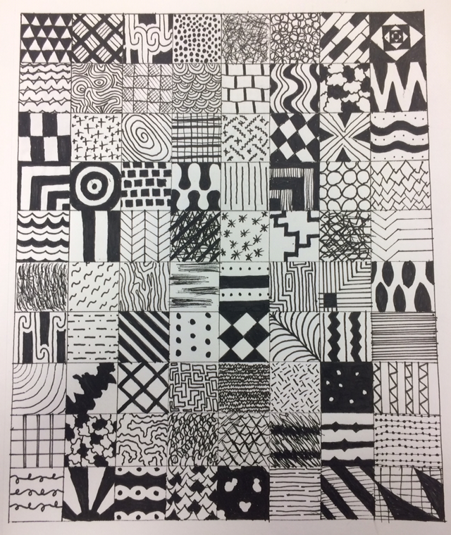
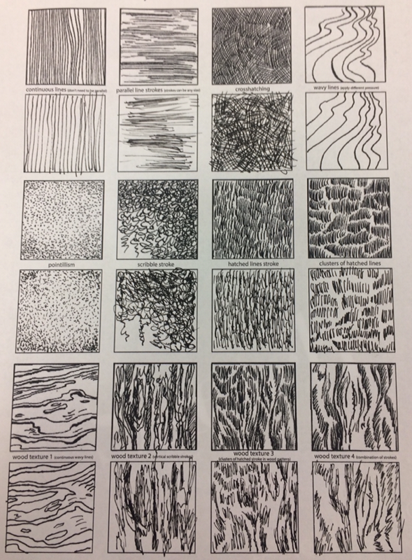
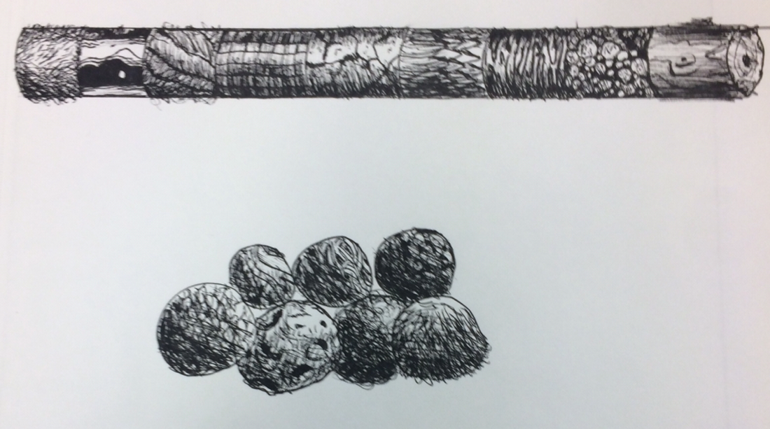
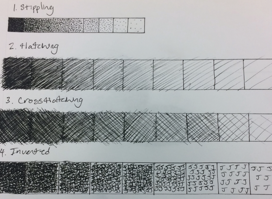
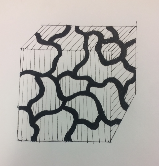
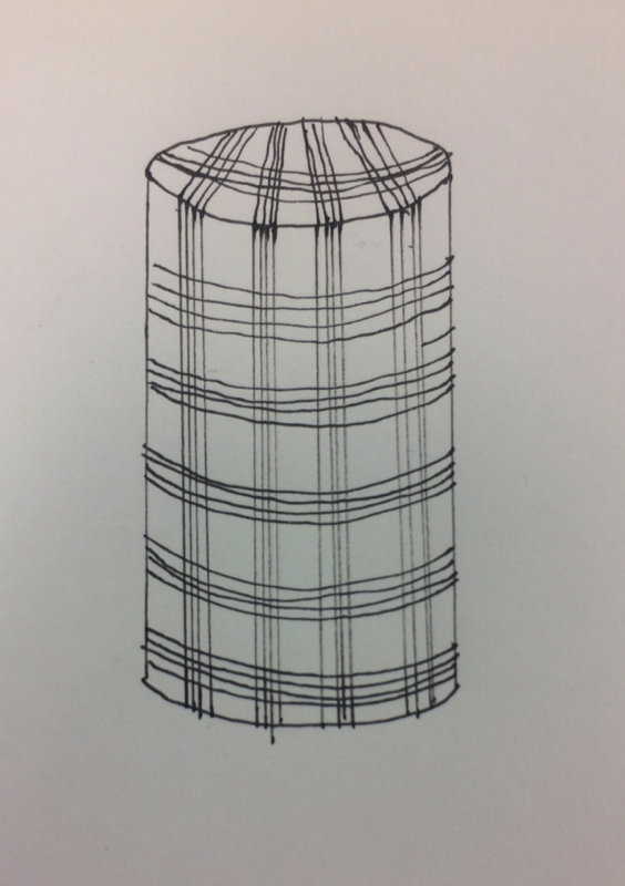
For the pen and ink unit we had to draw different shapes with value, create a value chart for different textures, practice with different textures on spheres and cylinders, and create 100 different textures. I liked doing this because I think that it looks really nice when it is done.
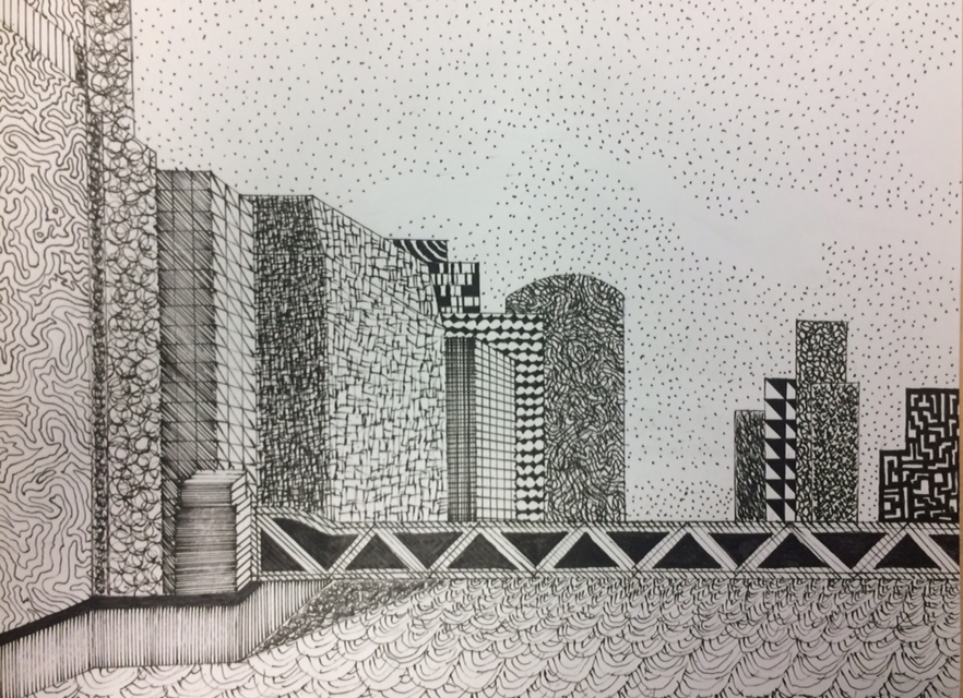
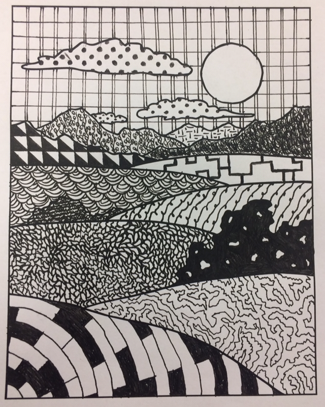
Final Project
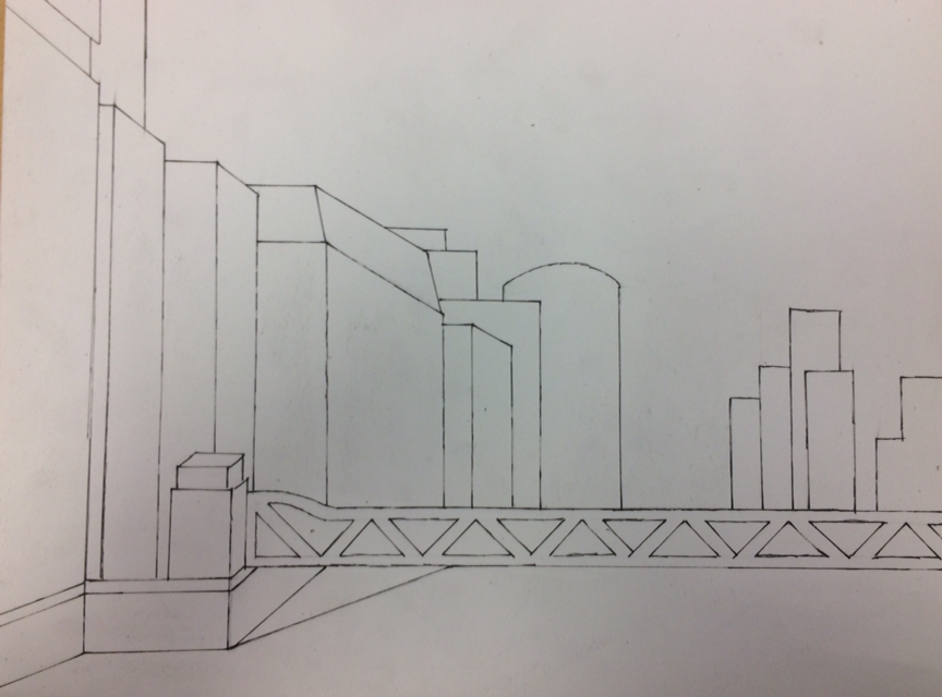
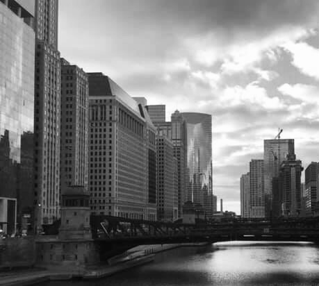
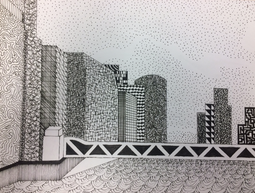
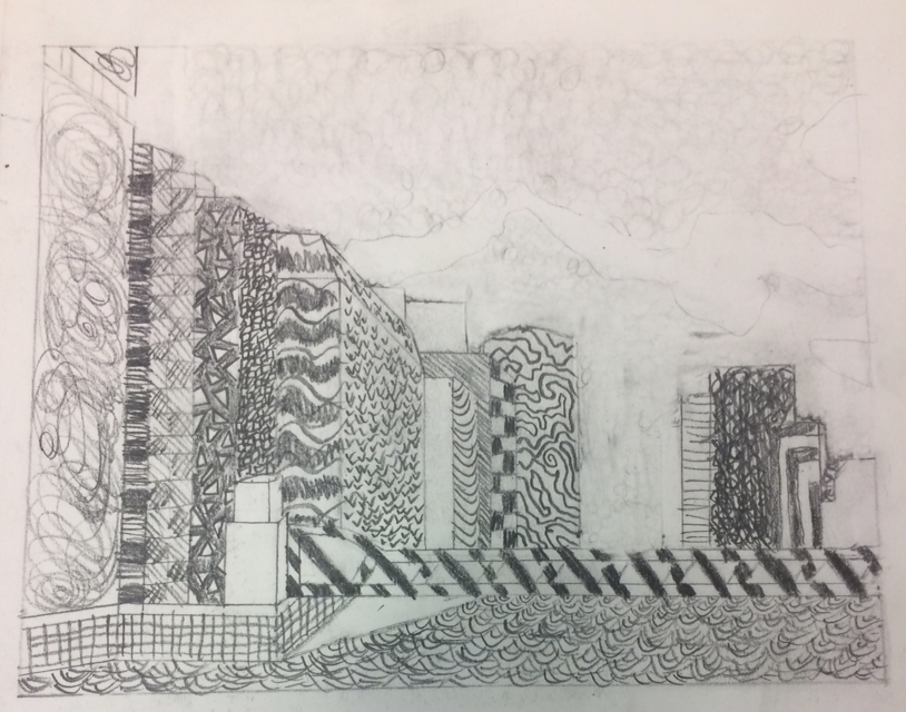

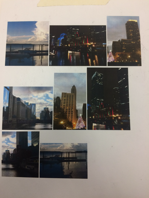
1. I started out by finding the pictures that I wanted and cropped them in different ways to get my composition. I picked my 3 favorite compositions and picked the best one. I think that it is a successful composition because it looks good and it includes different things.
2. Texture and pattern in this project help you tell the difference between different objects and where the objects are in the picture. The bigger the pattern means that it is closer in the picture.
3. Value is important in this project because it helps you tell what objects are in front of other objects. It also helps you know how the actual image looked.
4. I think that the project was done really well and turned out good. I started out by drawing the outlines of the buildings so I knew where to put certain textures.
5. The practice before this project helped me know how to use the different textures and patterns to make the drawing look good. Without the practice, the drawing would look very sloppy and unorganized.
6. You need to make sure that you know the concepts in class for many reasons. If you don’t know the concepts, you won’t know how to use the pen to make different textures. You also won’t be able to know how to put the darks and the lights with the pen.
7. I have leaned how to be able to draw different textures with a pen and pencil like wood, fur, and water. I will be able to use this knowledge in later projects with similar textures.
8. If I were to do this project differently, I would probably change how the sky and the bridge looks. I would also try to add more darks and better shadows in the final piece.
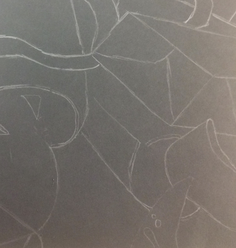
Water Color, Pastel, and Colored Pencil
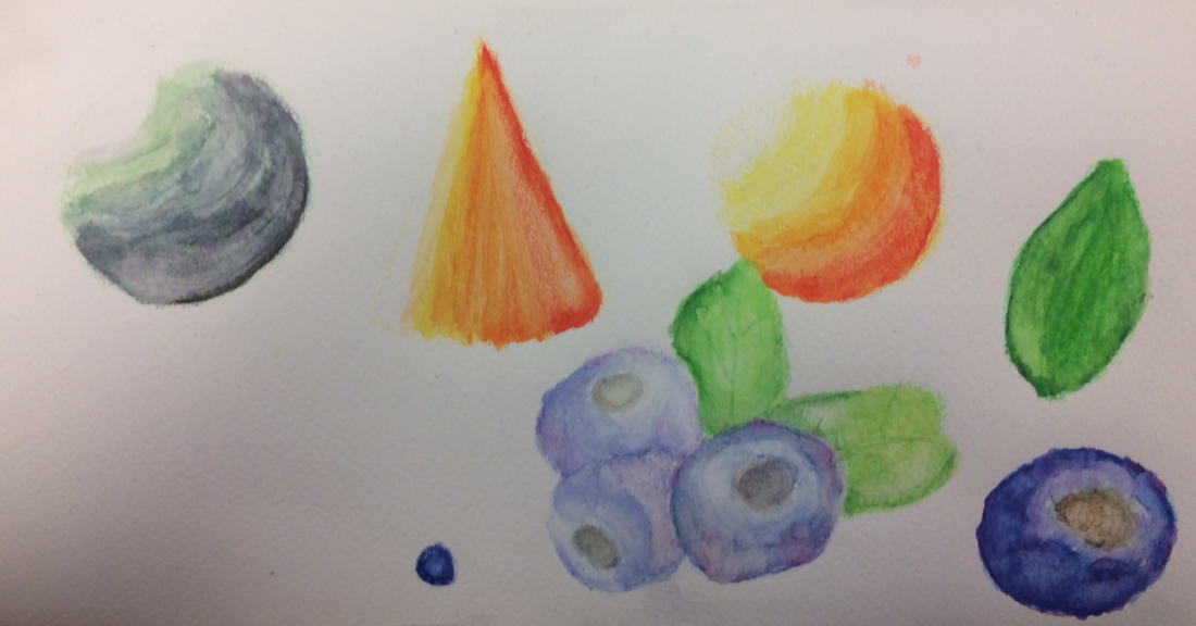
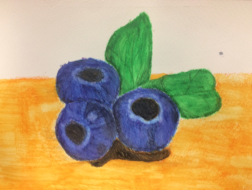
We practiced different objects with the watercolor pastel. After we practiced we had to draw our fruit/vegetable. I liked how it turned out, but I didn’t really like using the watercolor pastel.
We used colored pencils to draw different objects before we did our final. I liked how you were able to blend the colored pencils and how the color looked in the end. I wish that I would have done the leaves a little better.
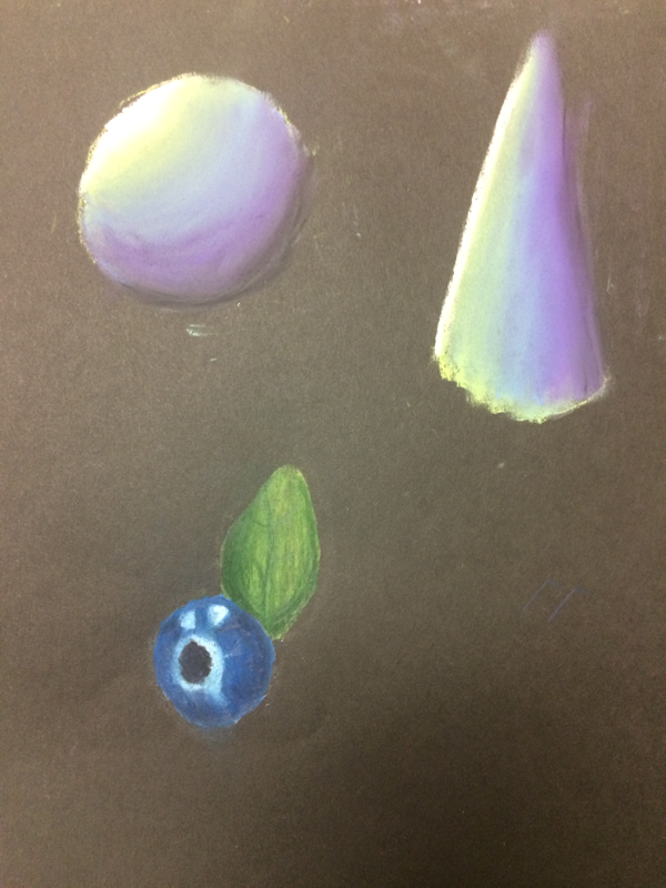
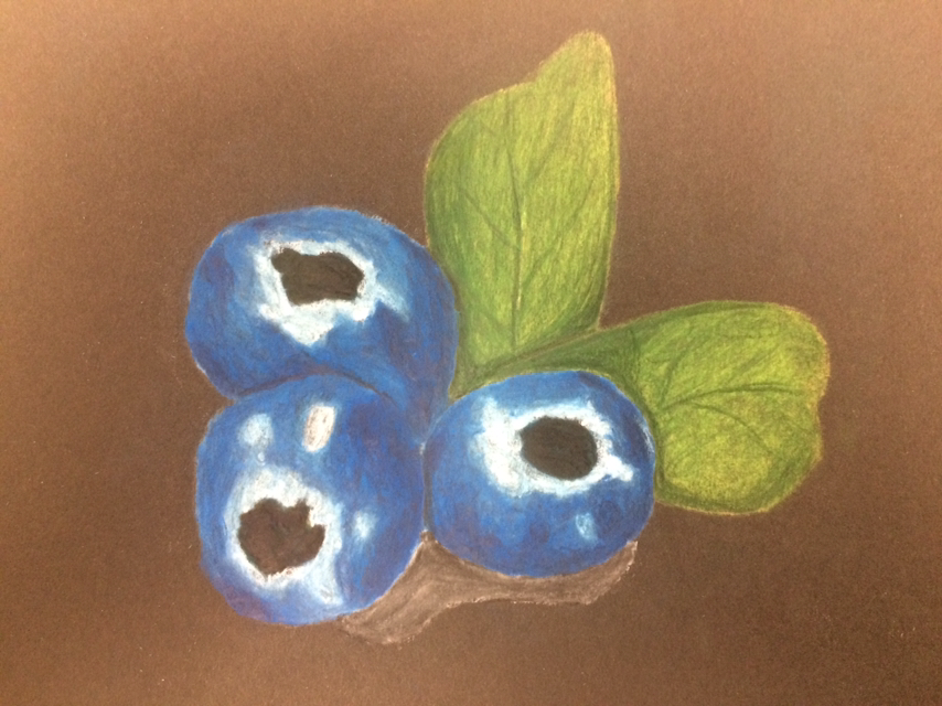
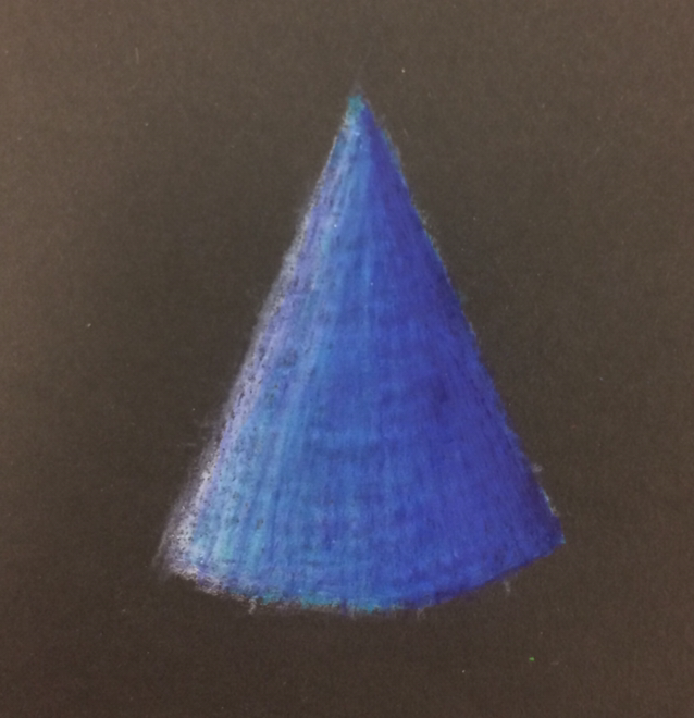
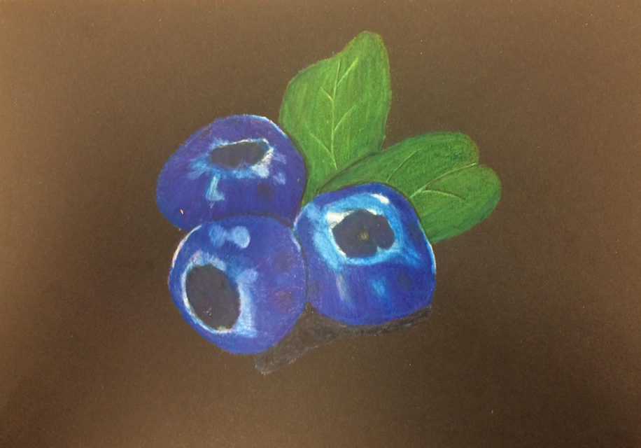
For the pastel we had to practice using the pastel sticks and the pastel pencils. I really like how you are able to apply different layers with the pastel and get them to blend. I would change the way that I did the highlights on the blueberries.
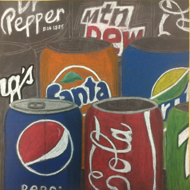
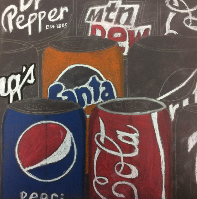
Final
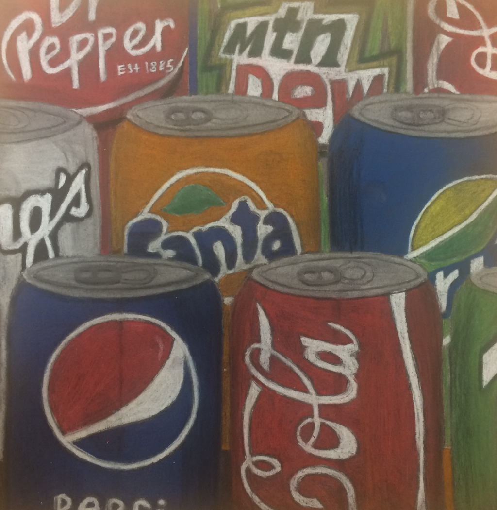
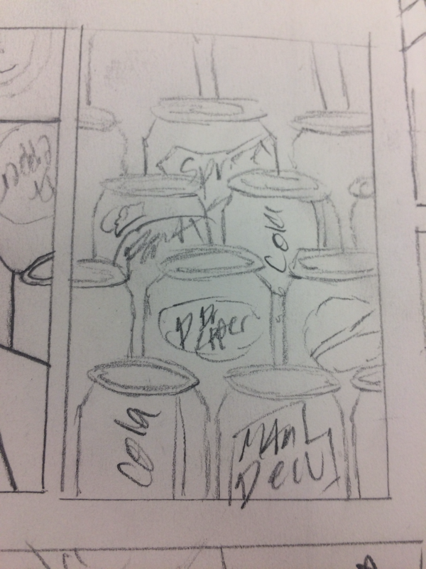
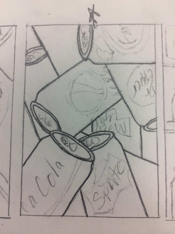
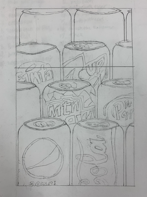
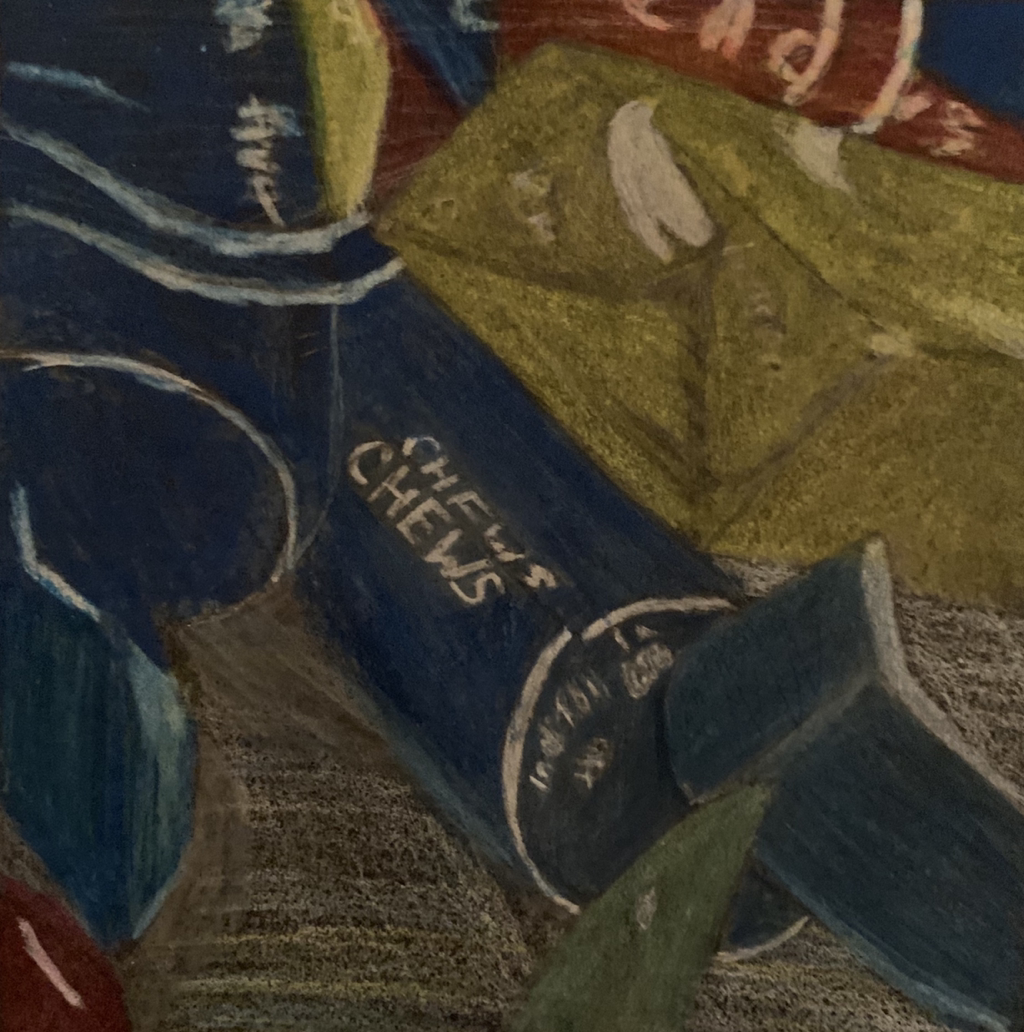
1. The composition of my final piece was an up close phot of pop cans lined up.
2. I used darks on the cans to show that they were 3D. I also added shadows to show which objects were in front of each other and to show where the light was coming from.
3. I achieved a good value range by using exaggerated color. It helped show how the cans would look if you were right there.
4. I like how it was crafted overall. It helped me be able to plan the final and get it to look nice.
5. I was able to achieve depth by adding shadows to the cans in the back and adding darks and lights to the final.
6. I really liked using the chalk because you could blend it really easily. I don’t like how messy it is and how you can’t get fine lines with chalk.
Printmaking
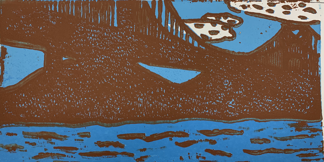
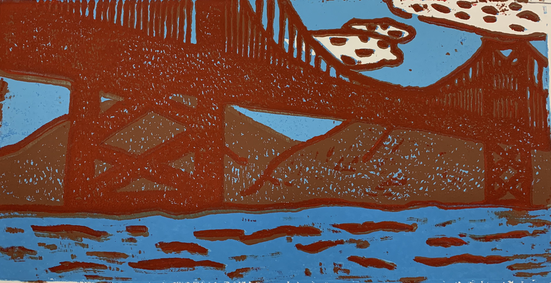
Final
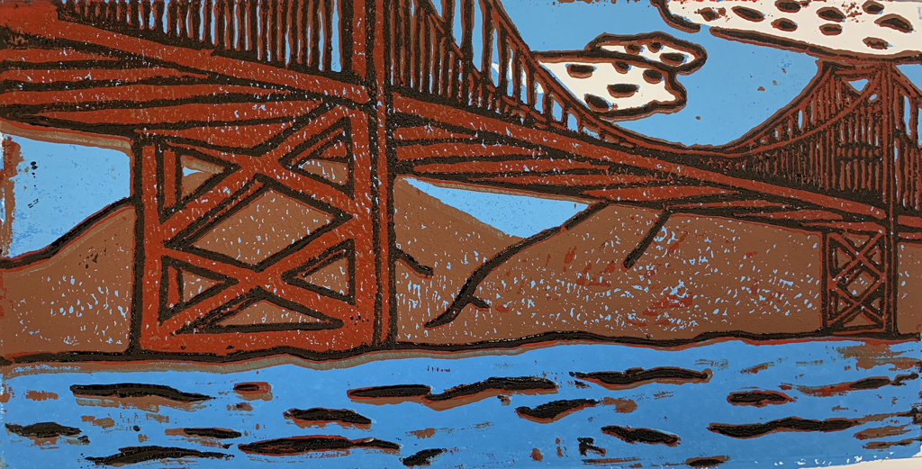
1. Overall the ink coverage is okay. I feel that I could have added more ink where it didn’t fill in all the way. The carving turned out pretty good. I wish that I could have made some more detail and better outlines on the objects.
2. I added black to the objects to add texture to the clouds, water, and hills behind the bridge. I feel that the colors look good with each other. There is a good balance between the water, sky, and the hills.
3. If I were to recreate my piece I would make the water darker than the sky. I would also make the black lines smaller. I would have liked to line the prints up better than I did.
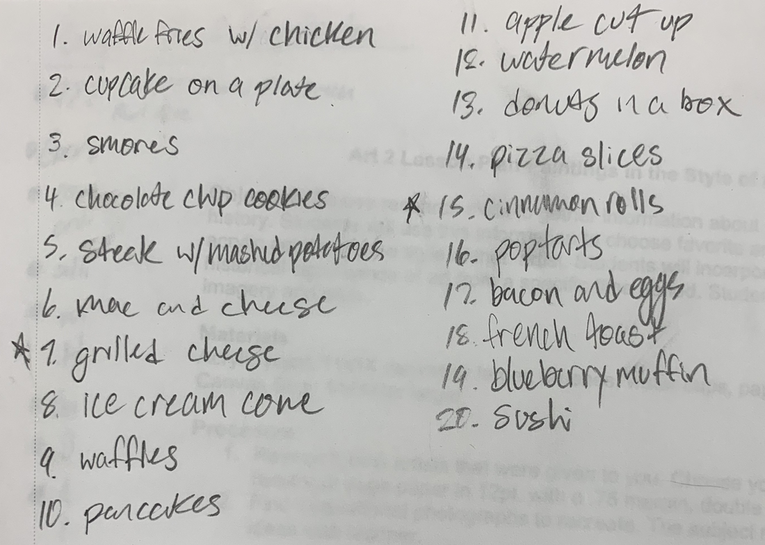
Clay
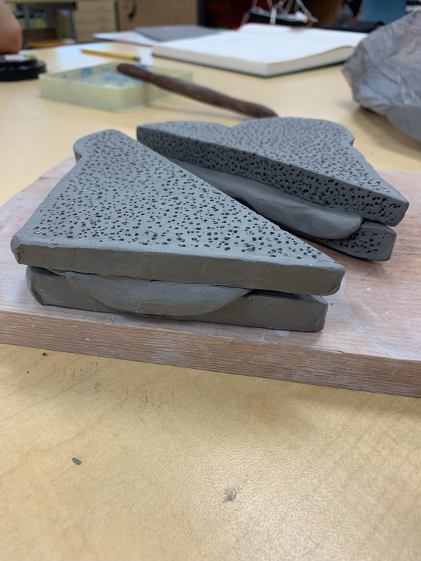
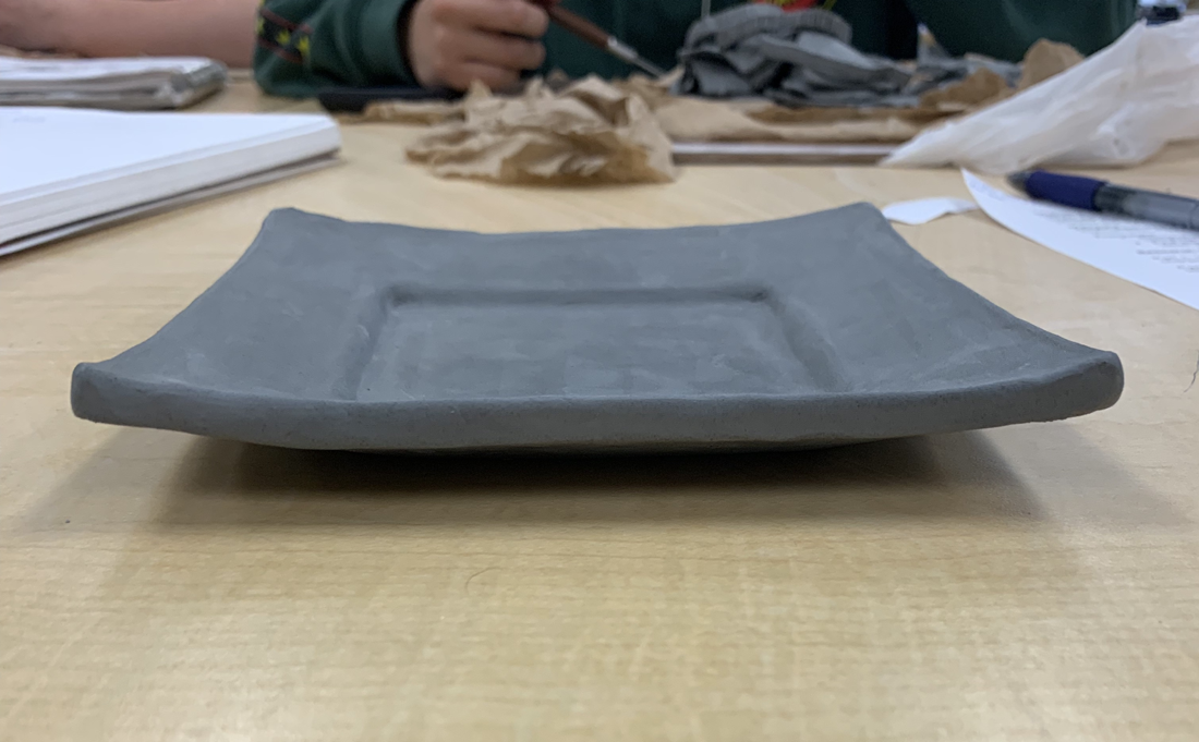
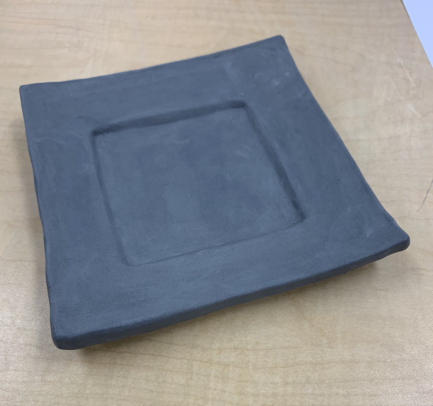
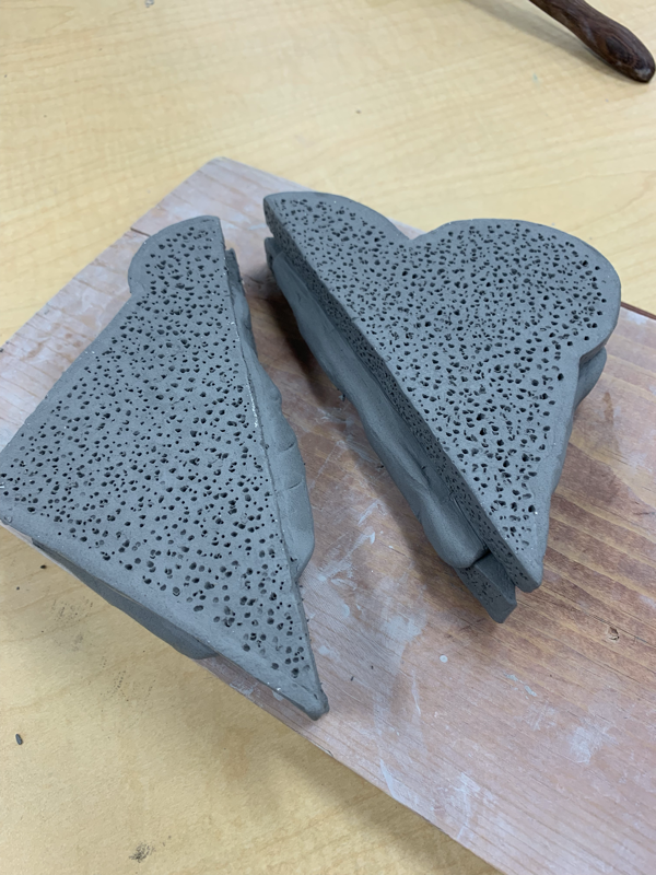
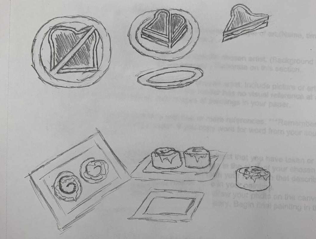
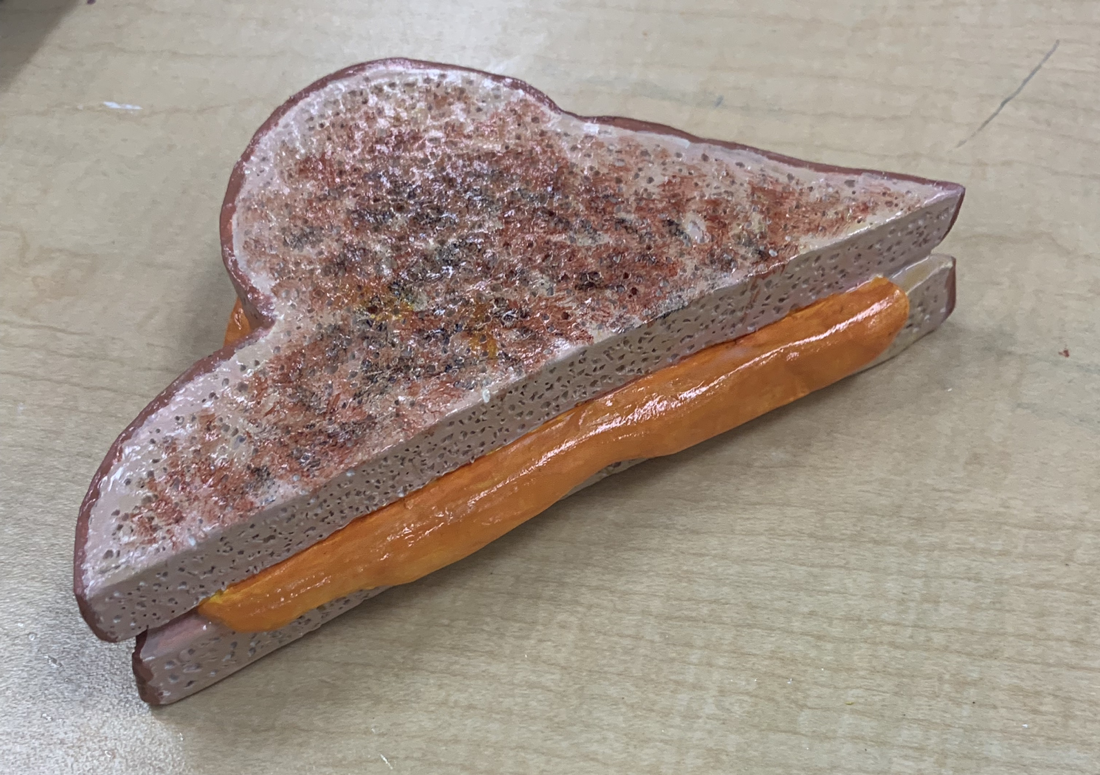
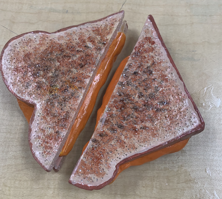
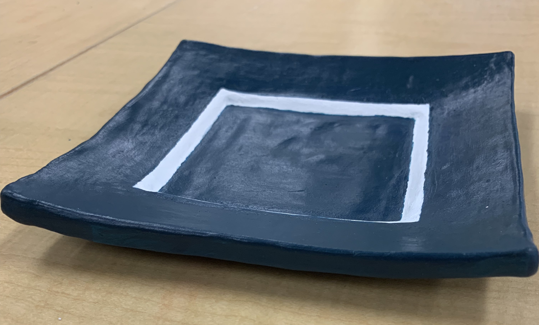
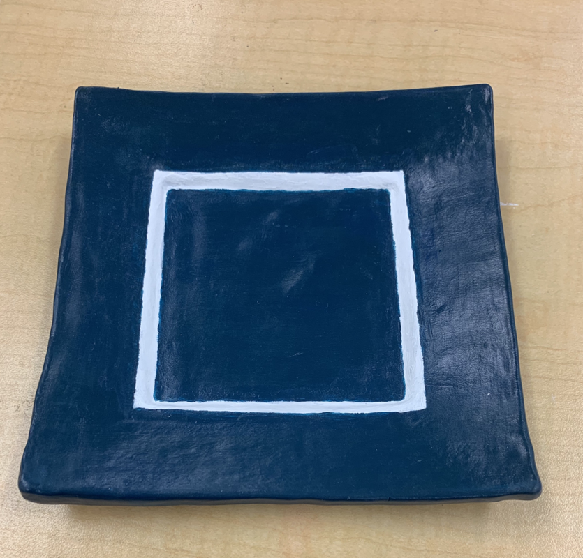
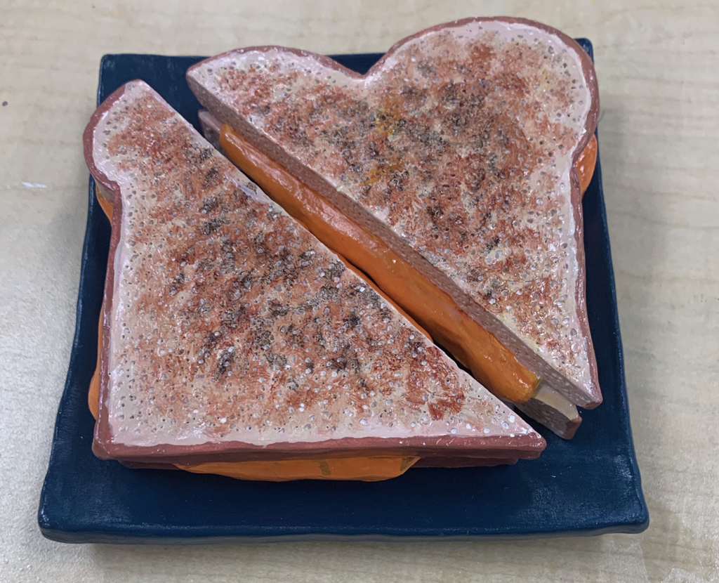
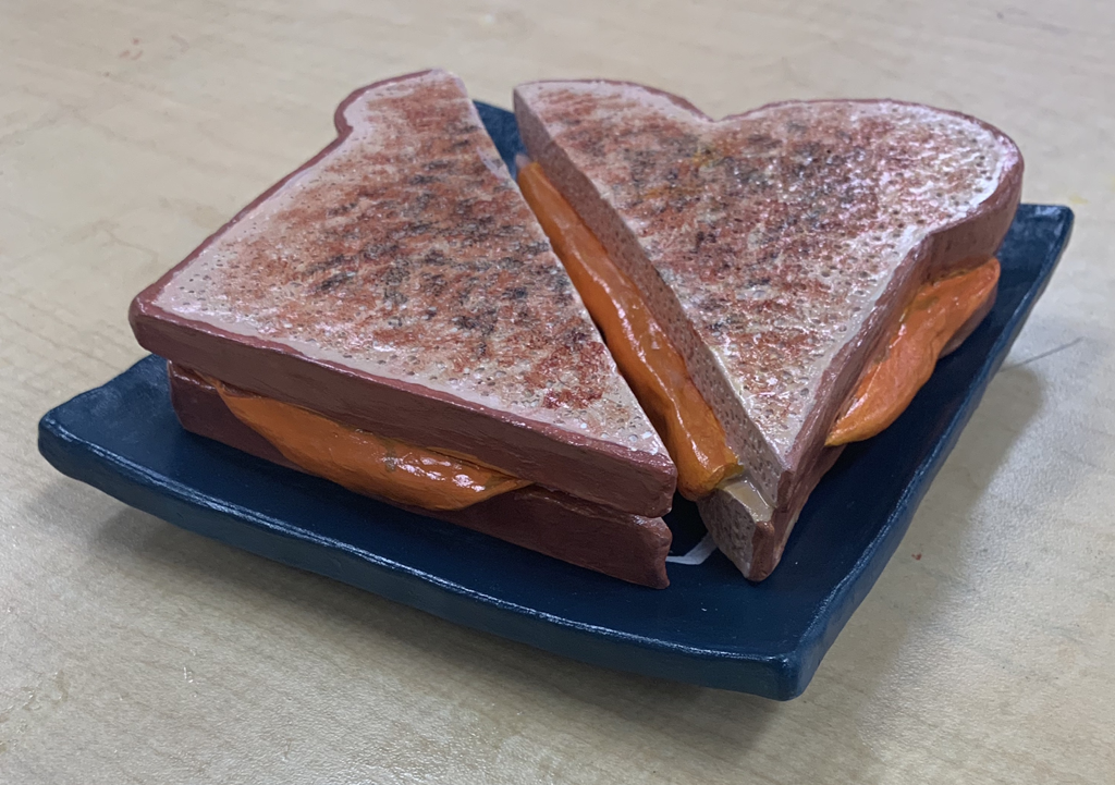
1. I feel that my craftsmanship of my sculpture was pretty good. I like how the grilled cheese looked realistic. I also like how my plate looked when it was finished.
2. I think that the most difficult part of the project was trying to make the grilled cheese look realistic. It was hard to get all of the right colors and make it look good. I wish that I would have made the cheese look more yellow.
3. I think that my choice of the grilled cheese and plate look good together. I tried to make the color of the grilled cheese look good with the color of the plate. I think that I did a good job making them go with each other.
4. I think that my sculpture is interesting from all views. It looks cool how the cheese is melting out of the sides.
5. When sculpting, you have to think of what it would look like all the way around. When drawing something in 2D, you have to use different values to make the object look 3D.
6. I created textures in the bread by using a needle tool to poke holes, so that it would look realistic.
7. I think that my sculpture looks like an actual grilled cheese. I made the cheese look real by having it drip out the sides. I gave the bread texture by poking holes in it.
8. If I were to do this project differently I would try to make the colors of the grilled cheese look more realistic. I would also try to smooth out the plate a little more just so that it looks better.
Painting
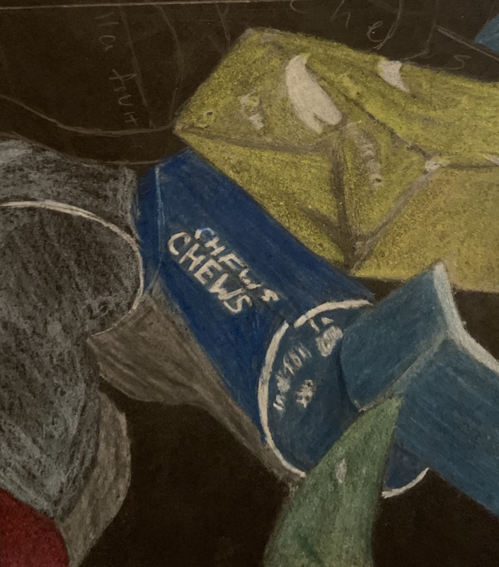
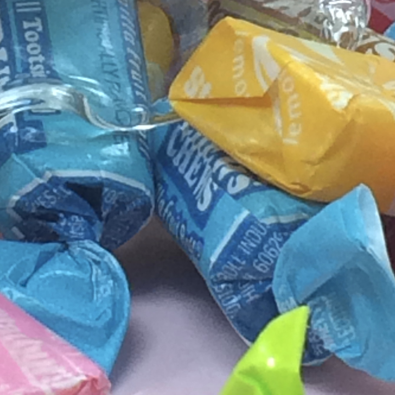
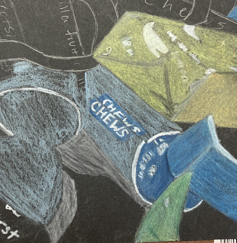
Candy Drawing